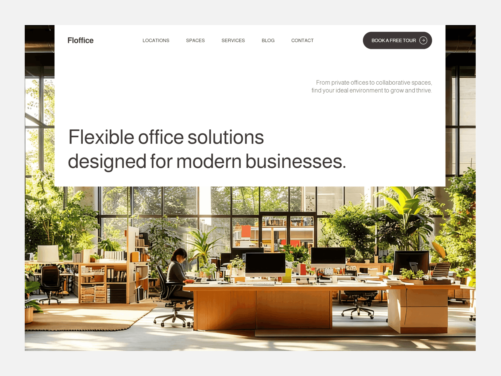
Design System
Design System
01 Type
Text styles
Heading 1 XL
The hero line on Home only. 200 px, h1.
Archiste
Heading 1 L
Page titles on subpages. 120 px, h1.
Projects
Heading 2 L
One large statement per page. 60 px, h2.
Designed to last
Heading 2
Section headings. 50 px, h2.
Architectural Approach
Heading 3
Card and project titles. 36 px, h3.
Riverside House
Heading 4
Titles inside cards and rows. 28 px, h4.
Interior design
Heading 5
Small titles: team names, awards. 24 px, h5.
Mara Lindqvist
Heading 6
Labels inside rich text. 20 px, h6.
Project facts
Body L
Section leads and long text. 20 px regular.
Every interior is conceived with clarity, material integrity, and deliberate proportion.
Body L Medium
Emphasised leads and quotes. 20 px medium.
We work from the site outwards.
Body M
Card text, descriptions, footer. 18 px regular.
Completed in 2024 for a family of four. Timber frame, concrete base, three courtyards.
Body M Medium
Names, values and links in rows. 18 px medium.
Stockholm, Sweden
Label
Small labels: badges, taglines, meta. 14 px medium.
Architecture with passion
02 Colour
Colour styles
Neutral / Ink
#262424
Text, dark surfaces, the frame around sections.
Neutral / White
#FFFFFF
Section containers, cards, text on dark.
Neutral / Light
#F2F2F2
Page background, lines between rows, muted text on dark.
Text / Muted
#505159
Secondary text: descriptions, meta, captions.
State / Error
#FF2244
Only the error state of the form button.
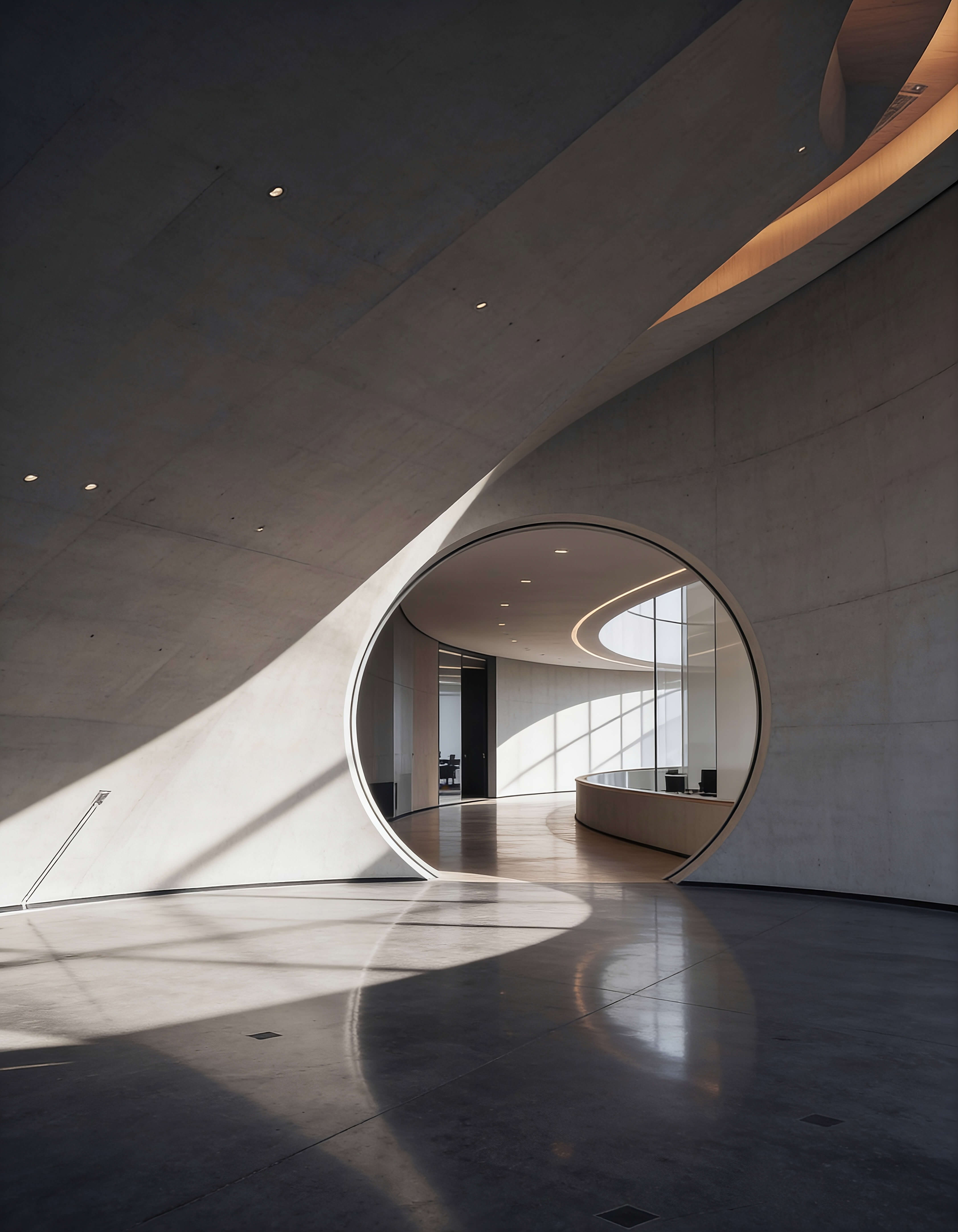
Overlay / Dark
Ink 40%
Scrim over photographs under text.
Overlay / Dark Strong
Ink 90%
Scrim over photographs behind the menu.
Overlay / Dark Fade
Ink 0%
Transparent end of a gradient over a photo.
Overlay / White Fade
White 0%
Transparent end of a light gradient.
Overlay / Tint
Gray 10%
Soft tint on hover rows of the services list.
03 Photography
Photographs
01
Architecture photographed straight on or slightly elevated, in daylight. Concrete, timber, stone and glass in their real colours.
02
Wide frames for the hero and project covers (4:5 or 3:2), details for cards.
03
No people except the team portraits, no renders presented as photographs, no stock interiors.
04
Every photo layer has alt text that says what is in the picture: building, place, material.
05
New pages reuse the photographs in the project or the ones the user supplies. Ask instead of sourcing.
04 Components
Components
Button / Primary
The call to action. Light on dark surfaces, Dark on white. Variants: Light, Dark, each with Hover.
Button / Projects
Secondary button that turns dark on hover, used on Projects. Variants: Light, Dark.
All projects
All projects
Button / Submit
Submit button of the contact form. The form switches the states. Variants: Default, Loading, Disabled, Success, Error.
Badge / Label
Small label at the top of every section, left of the tagline.
Services
Link / Nav, Link / Icon
Text links: Nav (Default, Menu Item) in the navigation and footer, Icon with an arrow for inline links.
Icon / Arrow, Icon / Link, Icon / Menu, Logo / Mark
Arrow and Link icons in Default and Dark, the menu toggle in Closed and Open, the logo in Dark and Light.


Card / Service
One row of the services list: number, title, subtext, text. Variants: Desktop, Tablet, Phone.
Card / Project
Project row with name, location and short text; the photo comes from the Projects collection. Variants: Desktop, Tablet, Phone, Hover.
Card / Process, Card / Benefit, Card / Testimonial
Fixed-width cards for three- or four-column rows. Process has an icon, Benefit a title and text, Testimonial a quote with avatar.
Card / USP
Numbered statement with a photograph, used on About. Variants: Desktop, Phone.
Card / Team
Team member with portrait, name, position and two social links. Variants: Horizontal, Vertical, Tablet, Phone, each with Hover.
Card / Award, Card / Career, Card / Article, Card / Client Logo, Card / Project Details
Rows and small cards: awards (year, contest, award, text), open positions (Closed and Open), blog posts from the Articles collection, client logos, project facts.
LOCATION
Milan, Italy
Section / Testimonials, Section / Open Roles
Whole sections as components: the testimonial slider and the careers list with up to four roles (Open Roles has no phone variant, so it is hidden here on phone). Nav, Footer and Template Badges are placed by the Top and Footer layout template and are not shown here.
Clarity in Every Detail
Understanding the client, the site, and the constraints before any form is defined.
Clarity in Every Detail
Understanding the client, the site, and the constraints before any form is defined.
Clarity in Every Detail
Understanding the client, the site, and the constraints before any form is defined.
05 Section grammar
How a page is built
Layout
Breakpoints 1200, 810, 390.
Every page sits in a Main frame filled with Ink. Sections are white containers with 10 px of Ink around them and padding 80 (40 on phone), content gap 60.
Section head: Badge / Label on the left, a Label tagline on the right, a 1 px Neutral / Light line under them; then Heading 2 at half width with a Body L lead on the right, max 400 px.
Content rows separated by 1 px Neutral / Light lines. Cards keep their fixed widths and wrap.
Corners 0. Photographs full bleed inside the container.
Voice
Calm and precise. Short sentences, no exclamation marks, no superlatives.
Project locations written as City, Country.
Headings name the subject: Architectural Approach, Selected Projects, Open Roles.
Leads explain the how in one or two sentences.
No facts invented: names, clients, numbers, awards come from the user.
Content
Projects and Articles live in the CMS; lists on Home read from them.
Team, services, process, awards and testimonials are component instances with their texts on the instance.
One h1 per page: Heading 1 XL on Home, Heading 1 L on subpages.
Every page uses the Top and Footer layout template.
Contact: konrad.design/contact.